
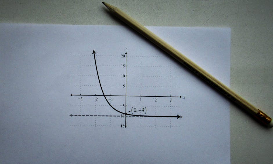
Creating high-quality mathematical graphs in LaTeX has never been easier, thanks to the powerful pgfplots package. Whether you're writing a research paper, a textbook, or a presentation, being able to plot functions directly within your LaTeX document ensures consistency and professional typography. In this comprehensive guide, we'll walk you through the essentials of plotting mathematical functions using PGFPlots, covering everything from basic setup to advanced customization.
Why Use PGFPlots for LaTeX Graphs?
PGFPlots is built on top of the TikZ graphics engine, which means it inherits TikZ's flexibility and precision. Unlike external image files, PGFPlots generates vector graphics that scale perfectly and match your document's fonts and styles. This makes it ideal for academic and technical documents where clarity and consistency are paramount. Moreover, PGFPlots can compute function values on the fly, so you don't need to pre-calculate data points.
Getting Started: Basic Setup
To use PGFPlots, you need to include the package in your preamble:
\usepackage{pgfplots}
\pgfplotsset{compat=1.18}
The compat option ensures compatibility with the latest features. Now you're ready to create your first plot.
Creating Your First Plot with pgfplots axis
The core environment for plotting is axis. Here's a minimal example that plots the sine function:
\begin{tikzpicture}
\begin{axis}[
    title={Sine Function},
    xlabel={$x$},
    ylabel={$\sin(x)$},
    domain=-2*pi:2*pi,
    samples=100,
    grid=major
]
\addplot[blue, thick] {sin(deg(x))};
\end{axis}
\end{tikzpicture}
This code produces a smooth sine curve. The domain sets the range for the x-axis, and samples determines how many points are used. The grid=major adds a helpful grid.
Understanding the pgfplots axis Environment
The axis environment is the heart of PGFPlots. It accepts numerous options to customize axes, labels, legends, and more. Key options include:
- xlabel, ylabel: Set axis labels.
- xmin, xmax, ymin, ymax: Manually set axis limits.
- title: Add a title to the plot.
- legend pos: Position the legend (e.g., north east).
- width, height: Control the plot dimensions.
Plotting Multiple Functions
You can easily add multiple plots within the same axis environment. Each \addplot command adds a new curve. For example, to compare sine and cosine:
\begin{axis}[legend pos=north east]
\addplot[red] {sin(deg(x))};
\addplot[blue] {cos(deg(x))};
\legend{$\sin(x)$, $\cos(x)$}
\end{axis}
This will generate two curves with a legend. The legend command is optional if you use \addlegendentry after each plot.
Customizing Your LaTeX Graph
PGFPlots offers extensive customization. You can change line styles, colors, markers, and more. For instance, to plot a dashed line with markers:
\addplot[dashed, mark=*, mark size=2pt, color=green] {x^2};You can also use mathematical expressions directly, such as {exp(-x^2)} for a Gaussian. PGFPlots handles the calculations, so you don't need to provide data points.
Using tikz plot function for Advanced Control
Sometimes you might need more control over the plotting process. The tikz plot function allows you to plot data points or use custom coordinates. For example, you can plot a function using the plot command within TikZ:
\draw plot[domain=0:4, samples=50] (\x, {\x^2});This is useful for simple plots without the full axis environment. However, for most mathematical functions, the axis environment is more convenient.
Adding Legends and Annotations
Legends are essential for multi-curve plots. Use legend pos to place them. For annotations, you can use \node within the axis environment. For example, to label a point:
\node at (axis cs:pi/2,1) {Maximum};The axis cs coordinate system refers to the data coordinates, making it easy to place labels relative to your data.
Common Pitfalls and Tips
- Use radians: Trigonometric functions in PGFPlots expect radians. Use
deg(x)to convert if needed. - Adjust samples: For smooth curves, increase
samples(e.g., 200). For sharp functions, more samples may be necessary. - Compile times: Complex plots can slow compilation. Consider using
externalizeto cache plots. - Compatibility: Always set
compatto avoid unexpected behavior.
Conclusion
PGFPlots is an indispensable tool for anyone needing to include mathematical graphs in LaTeX documents. Its ability to generate high-quality, consistent plots directly from code makes it a favorite among researchers and educators. By mastering the pgfplots axis environment and the tikz plot function, you can create stunning LaTeX graphs that enhance your documents. Start experimenting with the examples above, and soon you'll be plotting complex functions with ease.


0 Comments